
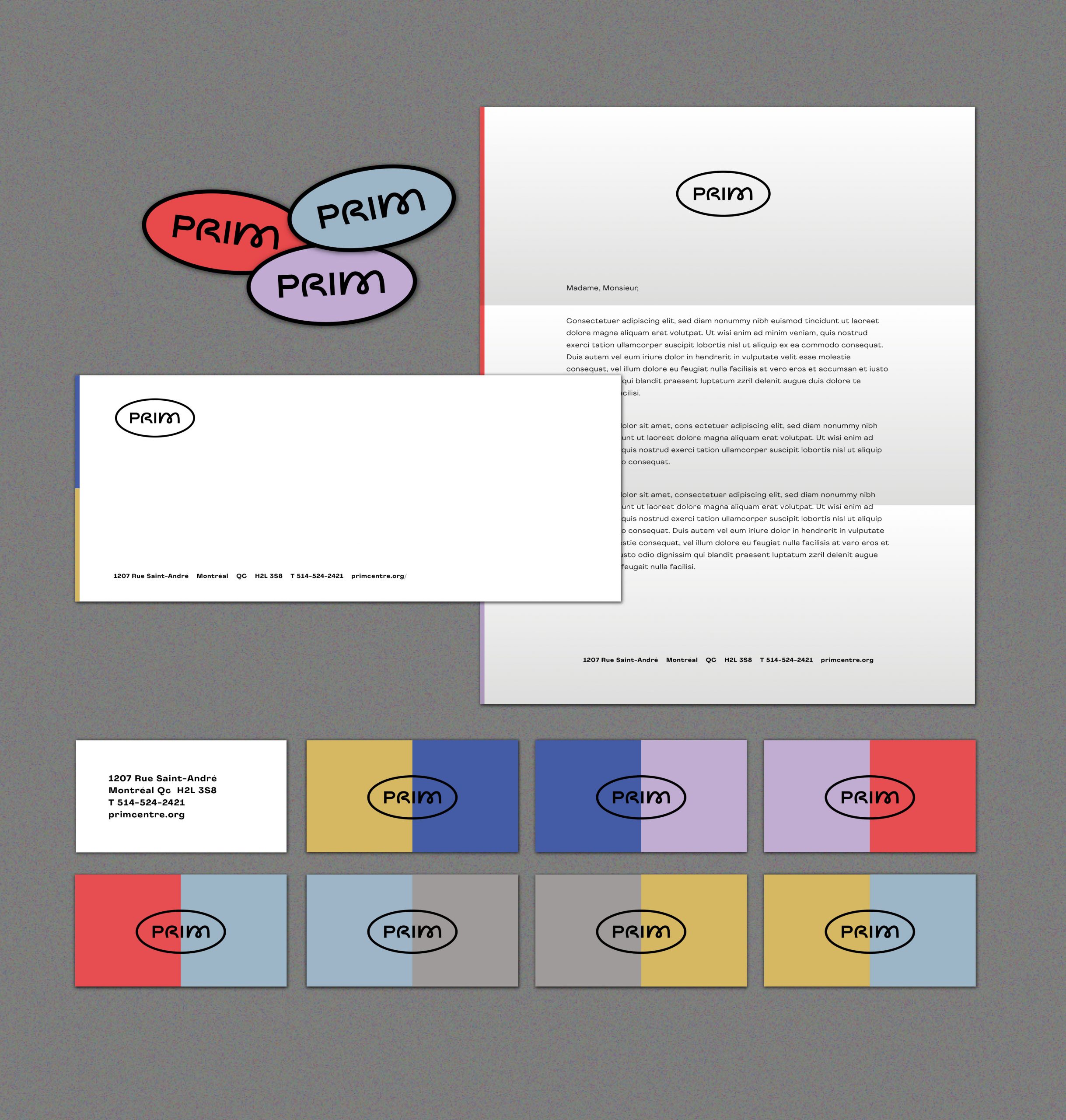
The entire team is proud to unveil the new PRIM colors!
This new image accompanies the reopening of the center and translates in a graphic way our will to anchor ourselves in modernity, to offer a unifying space, and to privilege creative freedom.
This minimalist logo allows us to leave all the space to the graphic creation, the way we leave all the creativity to our members. The oval shape that wraps around the logo represents support and inclusion, while the unique typography recalls freedom and creativity.
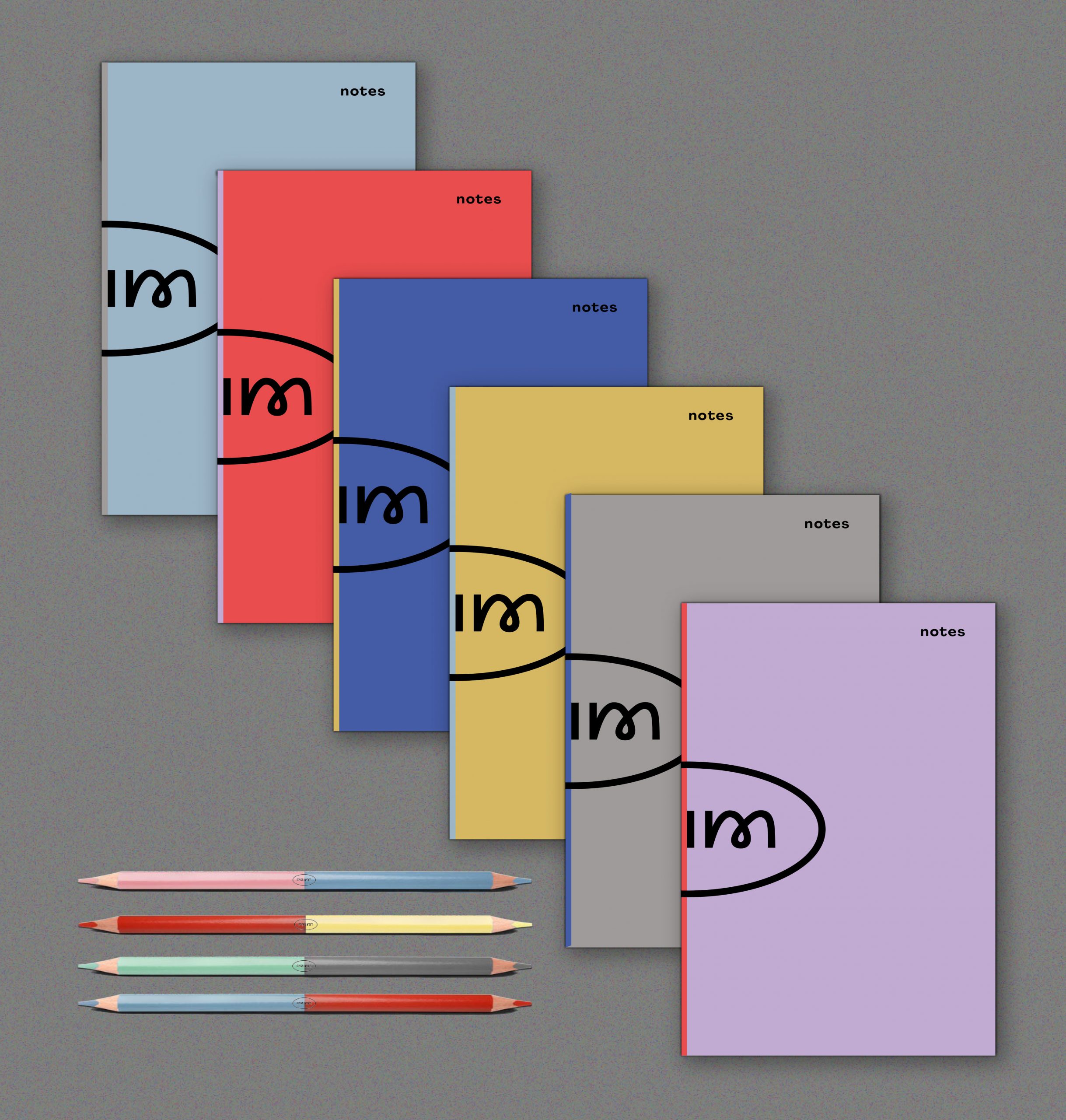
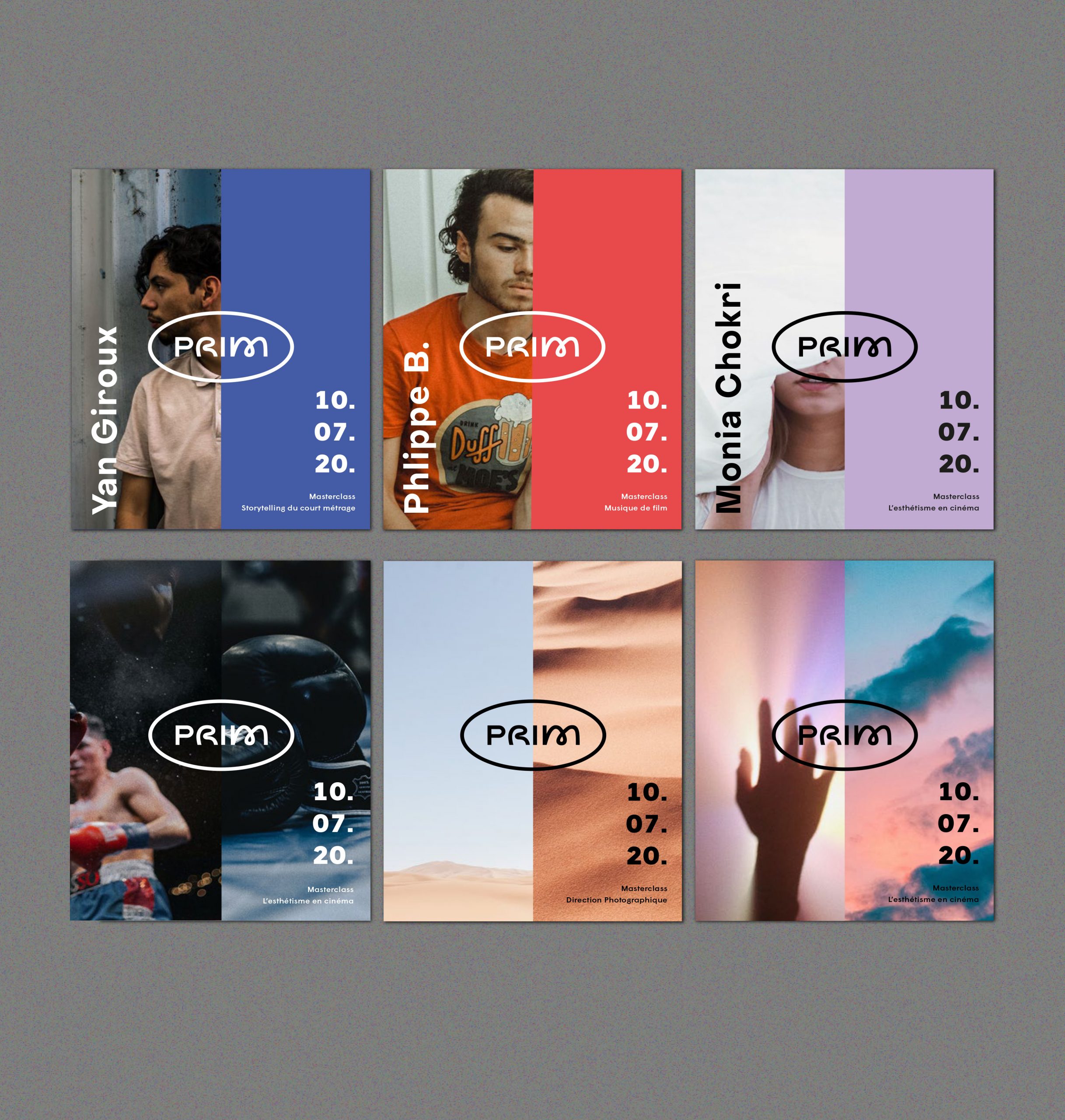
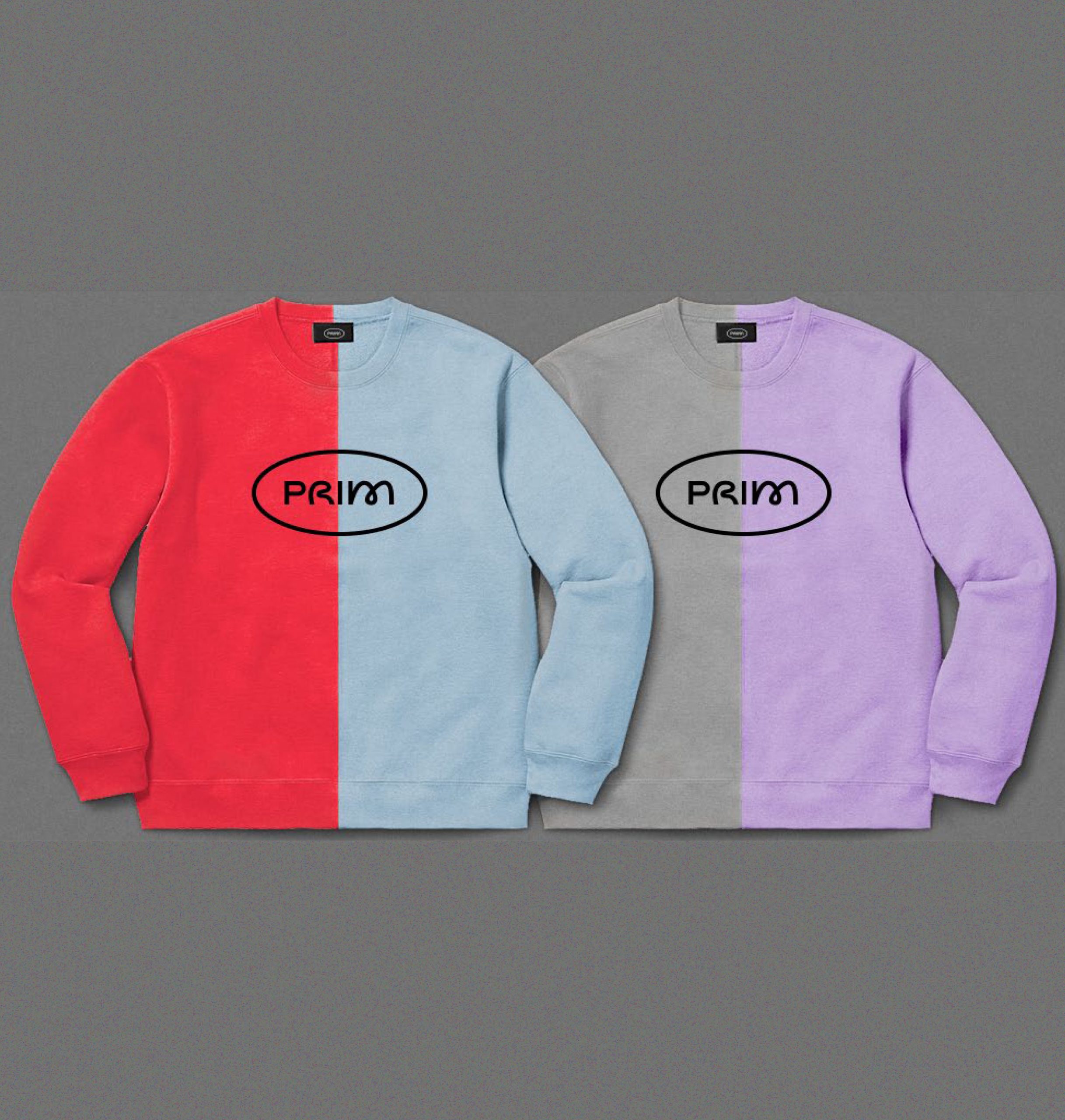
We also wanted to add color to our graphic charter. Thus our palette is composed of soft and joyful colors. It reflects a creative and daring universe and contributes to make PRIM accessible, inclusive and friendly.
This new visual identity, designed by Featuring, has been thought to adapt in multiple ways, and to make your moments spent with us pleasant, whether in the center or online.
The new design of the site puts the spotlight on your projects, offering them a beautiful space of visibility, while allowing you to know what is happening in the center, with the new format of the news.
So that browsing the new website is a bit like having a coffee in the agora – discovering members’ projects, chatting and having a good time!
← Back to articles